Project Background & Goal
Nikon Cameras is celebrating its 100th Anniversary of providing advanced imaging products to professional and hobbiest photographers.
In 2017, they idenified the need to pursue usability as one of their top business goals.
I set out to improve their information architecture to better support this goal and to create a better experience for Nikon's users.
The Problem
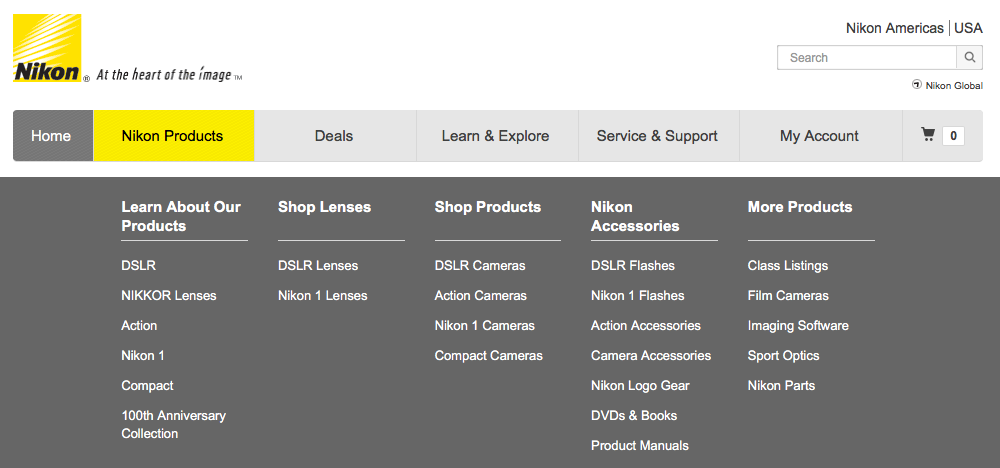
Nikon’s exisitng site’s navigation system presents too many choices for users, creating cognitive strain. Additionally, the site is not set up to support common user tasks.
Process
Step 1:
Understanding Users
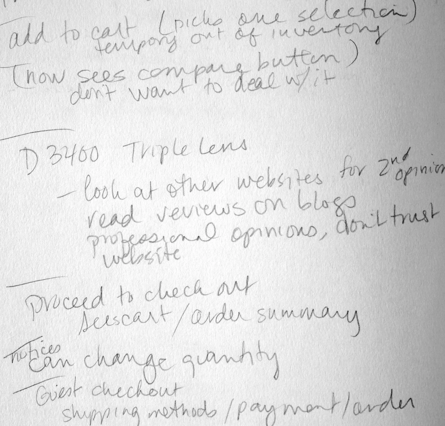
To better assess Nikon’s users’ goals, I conducted interviews and a survey.
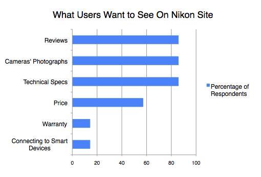
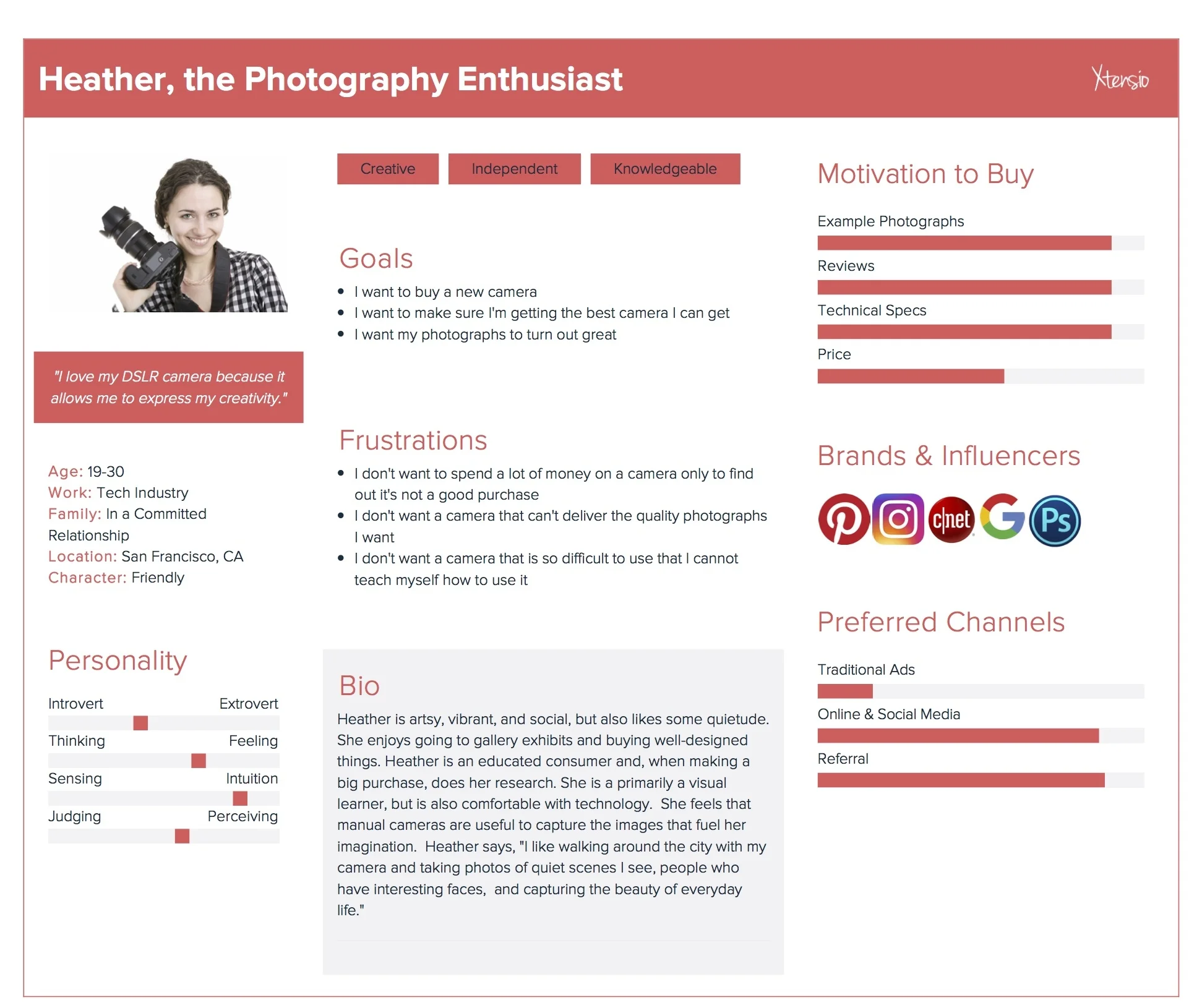
I found that most users wanted to read reviews, see example images taken by the cameras, and read technical specifications.
I then created a persona based on my findings. This helped empathize with the user as I proceeded with the redesign.
Step 2:
Identify Pain Points
My interviews helped me identify common user tasks.
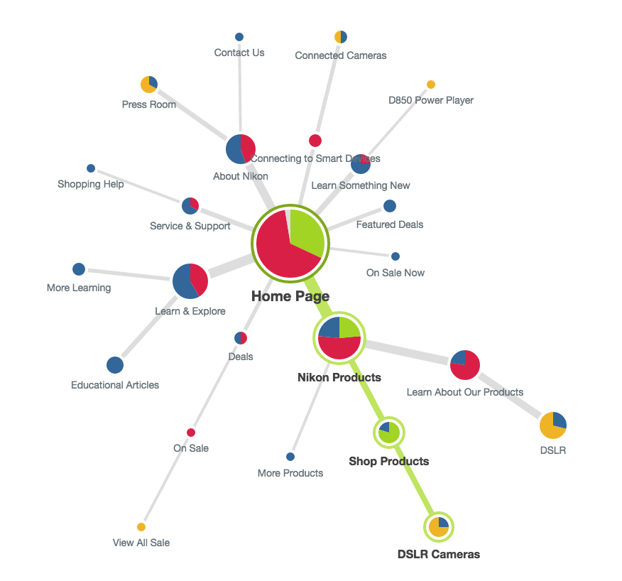
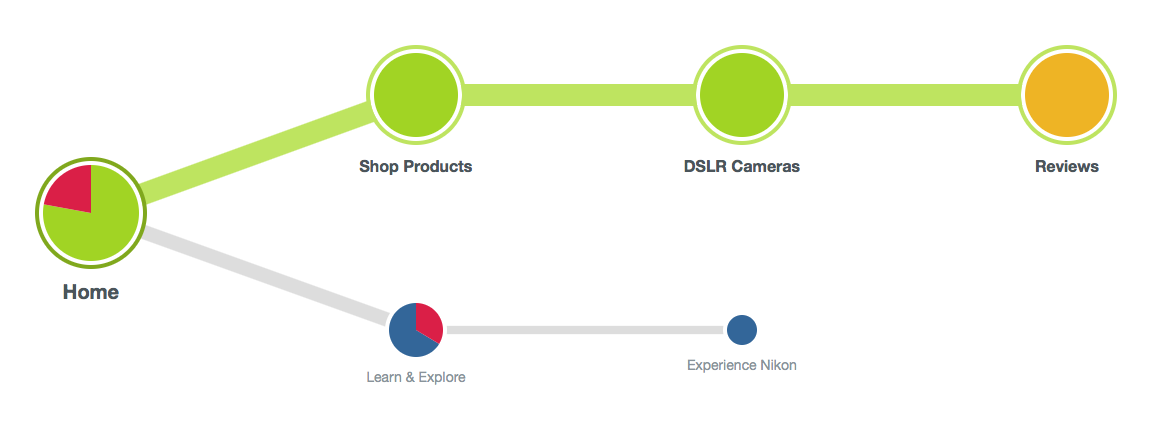
I used those to tree test Nikon's current information architecture.
I discovered many usability opportunities. For example, only 21% of test respondents were able to find “Reviews,” which was one of the top three items they wanted to see on the Nikon site.
Step 3:
Ideate on Label Names & Site Organization
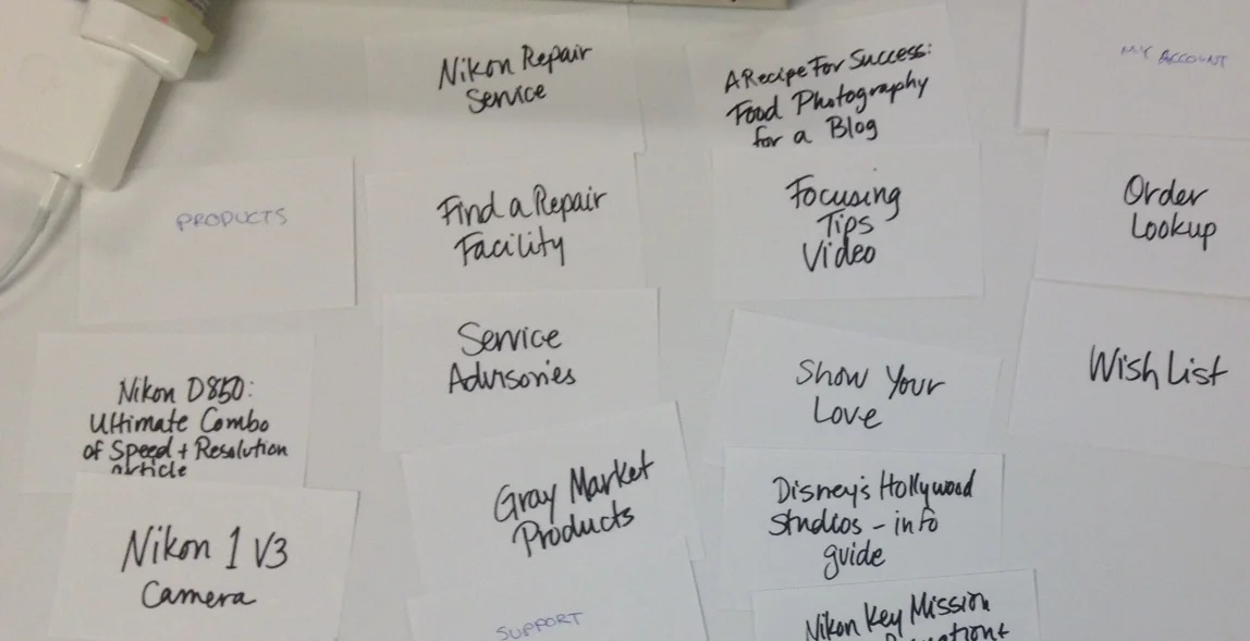
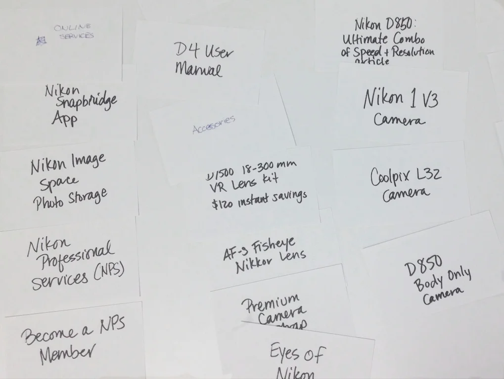
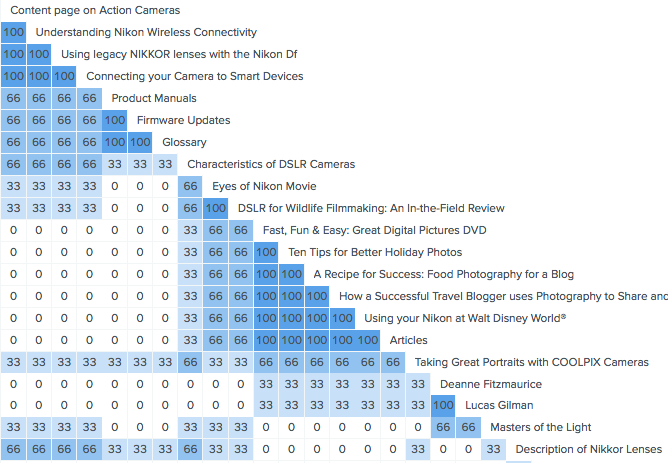
I conducted in-person and online card sorts to learn more about users' mental models, nomenclature, and where they would place certain items.
My research showed that there is an opportunity to consolidate some existing categories on the Nikon site (see: "Fast, Fun and Easy"... to "Articles") and to call the tab something like, “Articles/ Testimonials/ Blogs/ News” to match users’ nomenclature.
Also, it would be more likely match users’ mental models to group everything related to Nikkor lenses in one section of the site.
Step 4:
Redesign Site
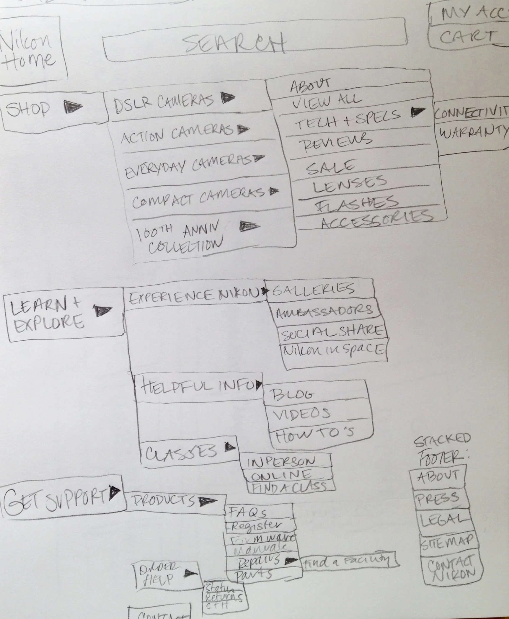
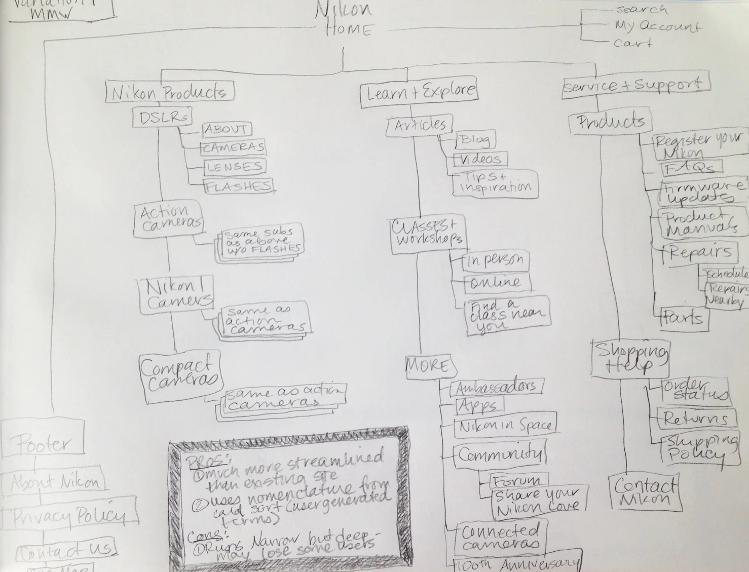
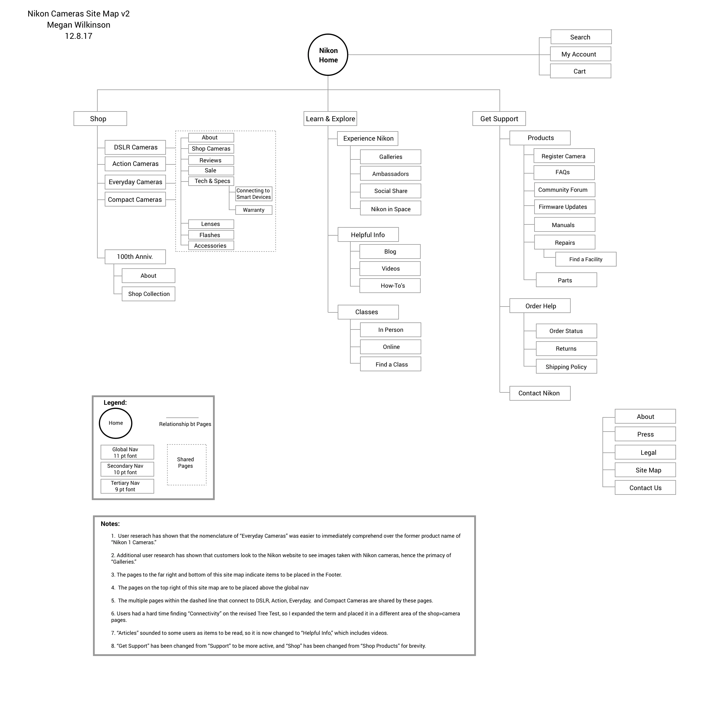
Based on my user research, I sketched and diagrammed new ideas for a revised site.
My plan kept the horizontal format of the global navigation, but refined the number of choices users faced, consolidated redundant information, and increased findability for key user needs.
Step 5:
Test Prototype
I performed a second tree test of my new site's layout.
Huzzah! 100% of respondents to the revised tree test were able to find “Reviews!”
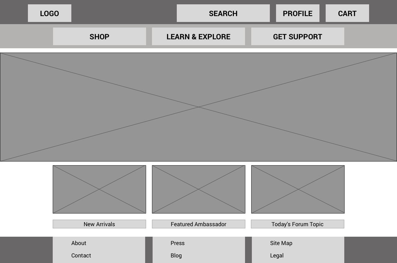
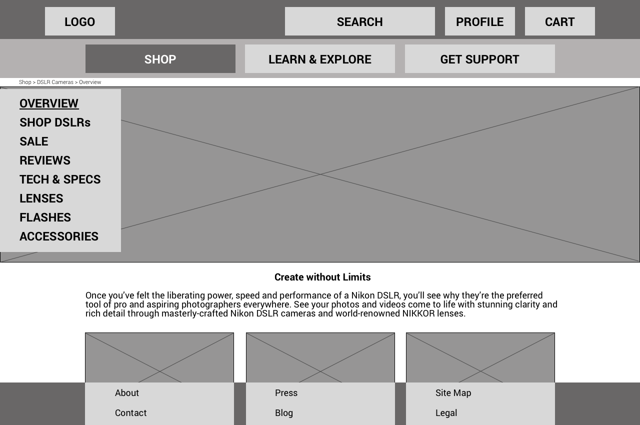
Step 6: Wireframes
I then created low-fidelity wireframes to help communicate my ideas visually.
Outcomes
Nikon’s new site reduces cognitive strain and supports common user tasks such as finding product reviews.
The revamped site is image-heavy to showcase photos from its cameras and the Galleries have been elevated in the hierarchy to appeal to user needs.
By making these changes, Nikon would not only improve user experience, but they would meet one of their top 2017 business goals.

