Goals
Complete a content audit of Nikon Cameras' website by documenting the diversity of content types, key messages, and Call to Actions (CTAs); identifying the intended audiences and customer journey stages; determine voice and tone; and analyzing the competition.
Key Finding #1:
“Learn More” CTA is Overused
On the Homepage, “Learn More” is used in 7 CTA buttons, outnumbering all other CTAs on the page.
On another page, it was used 8 times - this was the most I found out of the pages I audited.
In the 30 pages I audited, it appeared 47 times.
This is a problem because...
According to the Nielson Norman Group (NN/g), “Learn More” is too vague to be helpful for a user to predict what they will encounter when clicking on the CTA, and may cause cognitive strain.
It is also bad for accessibility: if a user is visually impaired, they won’t understand what the “Learn More” points to.
NN/g says, “Most screen-reader users will hear a list of links read to them, with no visual context to help them make sense of different generic Learn More(s).” See the NN/g article, “Learn More” Links: You Can Do Better."
Key Finding #2: Not All Videos are Accessible
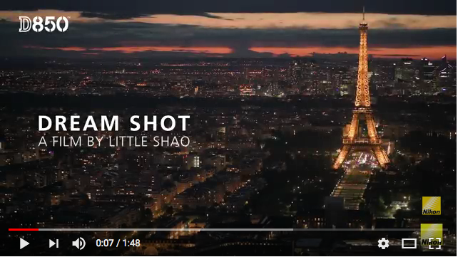
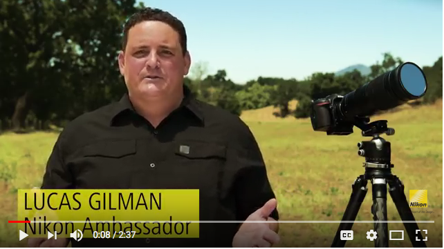
It’s great that Nikon adds a lot of varied content to its site like videos. However, out of 9 videos I audited, only 3 had Closed Captioning and Transcripts. Notice the lack of CC icon above, but that it is included in the video screenshot below (to the left of settings).
This is a problem because...
Users with hearing loss won’t be able to access Nikon’s content and it is Federal Law to provide these (Section 508 of the Rehabilitation Act). Therefore, Nikon could be sued for non-compliance. In 2014, Netflix was charged $755,000 for not having CC’ed videos.
Key Finding #3: Content Integration Needs Improvement
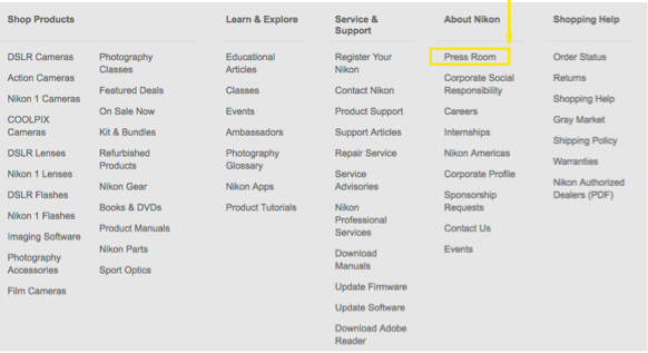
For Example, the “Press Room” link above is buried in the extensive footer of the Homepage.
This is a problem because...
There are a lot of valuable articles in the Press Room that could be directly accessed via the appropriate product page.
Users could benefit from reading what the press is saying about the products they want.
There is also an opportunity to include the Press Room as a link under the “Learn and Explore” tab of the global nav.
Key Finding #4:
Some Mobile Content Gets Cut-Off
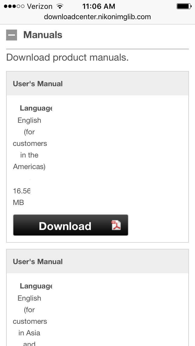
This screenshot is from the Download Center, part of the Support page tab of the D850 product page.
It’s an example of "Design Led" thinking and use of a constrictive template, because the content got cut off (see word "Language" and the "16.56" MB).
Also notice the large blank space to the right of the screen.
This is a problem because...
In their article, “Which Comes First? Layout or Content?” the Nielson Norman Group suggests that, “it’s best to design the layout and the content toward each other.”
They also write, “When redesigning websites for a great mobile experience, it’s best to use a responsive design, based on the optimized content for your users’ needs.”
This is a good example of responsive design.
Key Finding #5: VoC and VoE are Well Represented
Nikon does a great job of including the Voice of their Customers (VoC) and the Voice of their Employees (VoE) on the website.
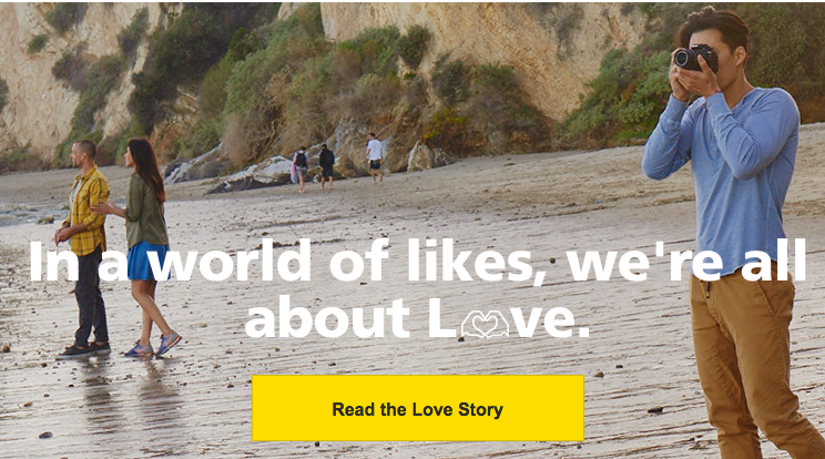
On the “Show Your Love Some Love” page (above), users’ social media photos are featured.
Nikon also sponsors professional photographers, a group called the “Nikon Ambassadors.”
Each of the Ambassadors has a profile page, and their photographic or film work is used throughout the site.
Takeaways
With a few fixes and a solid Content Strategy, Nikon’s users will be able to find what they need to continue to make great shots.

